
Web design isn’t just about how websites look anymore; it’s more about making sure users have a smooth experience on all kinds of devices. According to the International Trade Administration, Australia is the eleventh biggest e-commerce market in the world. By 2024, it is expected to bring in USD 32.3 billion. This means that people are actively taking advantage of how easy and convenient online shopping is thus having a website is crucial.
Significance Of Responsive Web Design in Parramatta
With more and more people using smartphones and laptops, it is important to have one that works well. Let us explore more on the significance of responsive web design that enhances user experience and highlights how local businesses like yours can benefit from having a mobile-friendly website.
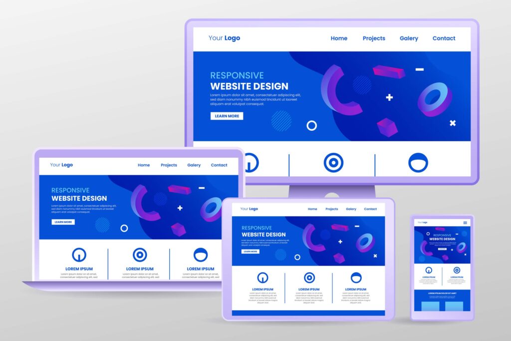
Responsive web design refers to the approach of designing a website that adapts and responds to various screen sizes and orientations.
Think of it like having a website that can change its shape to fit any screen. This means people won’t have to zoom in or scroll sideways to see everything clearly. They can easily navigate your website and enjoy a smooth experience that keeps them happy and engaged.
Making this a priority may give your business a chance to cater to the diverse needs of your audience, providing a consistent and user-friendly experience regardless of the device used.
How Does Responsive Web Design Work?
To achieve a responsive web design in Parramatta, there are key components that some experts consider. These will help your website boost its online visibility that lets you engage with potential customers, and ensure an optimal user experience that leaves a lasting impression.
- Mobile-First Approach: They start with mobile devices, this means that websites need to be designed and built with mobile devices in mind. They make sure that people using mobile devices have a smooth experience by putting the most important information and features at the top or designing the website using buttons that will fit in smaller screens and will lead to another page of the website.
- Fluid Grids and Flexible Images: They use grids that move and pictures that can be changed to fit different screen sizes. This will enable websites to adapt to different screen sizes and provide an optimal user experience to your consumers by ensuring that layouts and images adjust and scale dynamically. They use different techniques to achieve this such as manual resizing, HTML “srcset” attribute or CSS media queries. So to achieve this, having an expert manage your website is really a must.
- Touch-Friendly Interactions: By designing intuitive touch gestures and interactions, such as swiping, tapping, and pinching, the experts enhance navigation and user interaction on mobile devices. This improves the overall user experience and encourages users to engage more with your website that may drive more conversions.
- Content Prioritisation: Mobile users often have limited screen space, so it’s crucial to present the most important content upfront. Experts use techniques that help manage content hierarchy effectively and prevent overwhelming users with excessive information.
- Performance Optimisation: We often face slower internet connections, so optimising your website for faster loading is essential. By prioritising it, you can provide a smooth and efficient browsing experience to your users that will make them stay on your website and drive conversion.
Long Term Benefits of Responsive Web Design For Business Owners in Parramatta
Increased Reach And Accessibility
Enhanced User Experience
Improved Search Engine Optimisation
Cost Effectiveness And Future Proofing
Streamlined Analytics and Reporting
Having a single responsive website simplifies analytics and reporting. Instead of tracking separate metrics for different versions of your site, you can gather comprehensive data from one source. This allows you to gain valuable insights into user behavior, preferences, and conversion rates across all devices.
By working on the key components above, such as implementing a mobile-friendly layout, utilising a fluid grid system, optimising media content, and ensuring clear navigation, you can provide users with a consistent and enjoyable browsing experience.It is very important to enhance user experience as it will benefit your business in multiple ways. Having a website that functions well on all devices should be a priority and be treated as an investment for long term goals.
Moreover, a positive user experience resulting from responsive design can have a significant impact on customer satisfaction and brand perception. When users can effortlessly navigate and engage with your website, they are more likely to stay longer, explore your content, and convert into leads or customers. This, in turn, makes customers more loyal and boosts the image of your brand.
Lastly, investing in responsive web design is essential for boosting SEO, and ensuring long-term cost-effectiveness. By prioritising the functionality and adaptability of your website across devices, you are setting your business up for success in the ever-changing digital world.